


HasRoot 5.0 - Gradients Gone Wild Edition
So as I am sure you have all noticed by now HasRoot has changed. It is the largest visual update to the site so far and includes a bunch of new updates to the streamlist. In this long blog I will touch on some of the reasons why I made the changes and what issues I was trying to address. If you would rather just jump straight into the new update be sure to check out the new streamlist settings (especially preferred size) and side panel!
So why a new site update?
Over the years HasRoot has grown from a one page site to a much larger project. As things went along more functionality and pages have been added and we now track far more servers than I ever even considered, we now also track over 11k streamers. I am not a designer and have often thrown my hands up as far as design goes and trying to make things look good.
Recently however I had been working on a a prototype project for a future collaboration, the functionality was all there and I had some ok ideas but my execution was awful. After some sobering feedback I reached out to Lilly who is a HasRoot Team member who has design and art experience. Since joining she had always helped me out with suggestions or looking at some new small thing I was working on and giving feedback but this time she really helped beat some basic design sense into me. The result was light years better, the same original concept just better execution and from that experience I gained some confidence (perhaps foolishly).
As things with that project slowed down for awhile I decided to use my new found confidence to try and tackle some of the things that have long bothered me about the HasRoot site.
The issues I wanted to address
The menu bar kept growing in complexity and was getting more clunky, it wasn't touch/mobile friendly and with HasRoot constantly adding more servers (and games) it was an ever growing issue. Partially because I was lazy and partially because of the growing complexity I removed the 'jump to' functionality, which meant that a server change in the old menu always required a page pick after and that wasn't always obvious. The server list grew so large that we had to add a 'not in main menu dropdown' and only viewable via view more. From the day we added rdr2rp I swore that remaking it was going to be a priority.
I have felt that the stream list had grown outdated and was one area of the site I had never improved over the years. I was not a fan of the borders for the streams and after making the PoV Viewer the lack of ability to change the stream sizes bothered me. The inability to very quickly and easily find a streamer without having to use the search or a specific server for that matter. The repeated spam of 'show characters' and hard to click on links on mobile. Titles being hard to read and just a general lack of customisation. The awful server order changer and the over complicated nature of per server overrides.
The settings system was really bad, in how it stored data, how it was written and in the format it was presented in. While I wanted to include all of the original settings the entire thing really was in need of a rewrite. Some of them were just over complicated, it didn't handle the number of servers we tracked, it was just pretty awful in general.
So whats new?
Streamlist
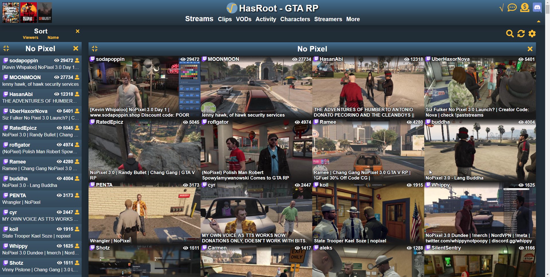
We now have a 'quick nav' side panel, which allows you to sort the streamlist and side panel based on viewers and names. There is also management for temporarily excluding of servers and the old minimise/expand functionality. You can use it to go straight to peoples channels, streamer profile pages or jump to the stream container for a specific server.
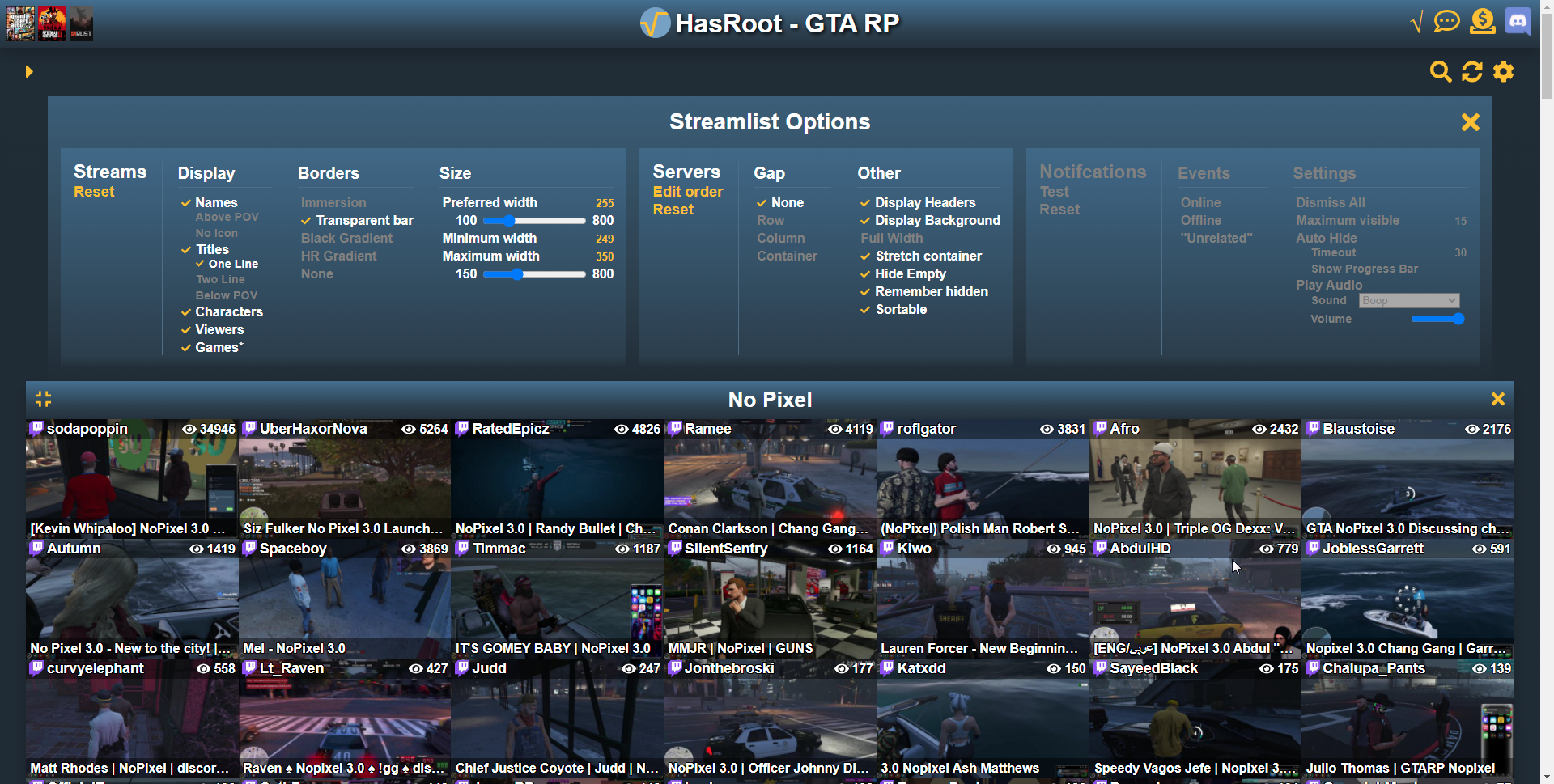
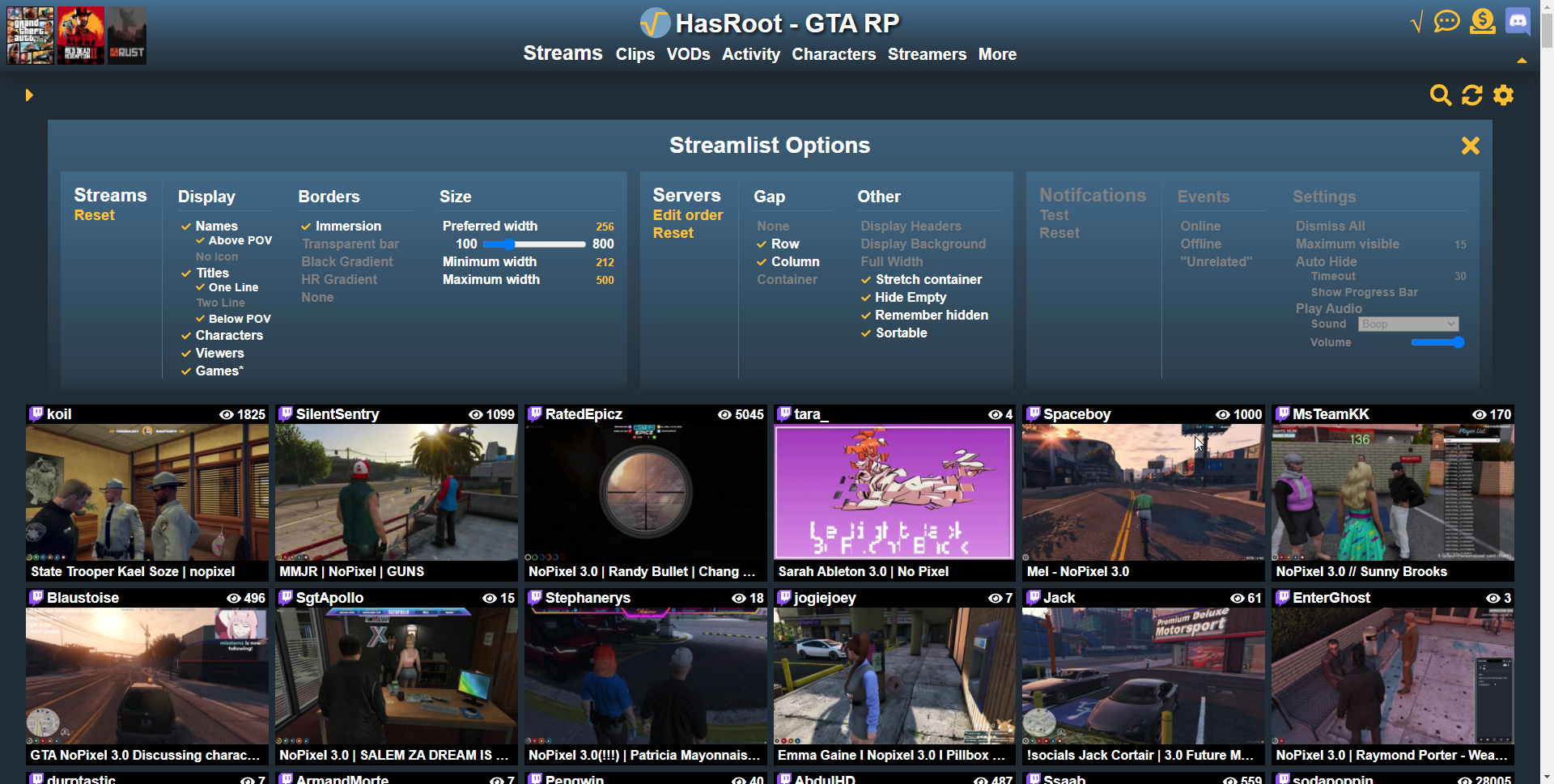
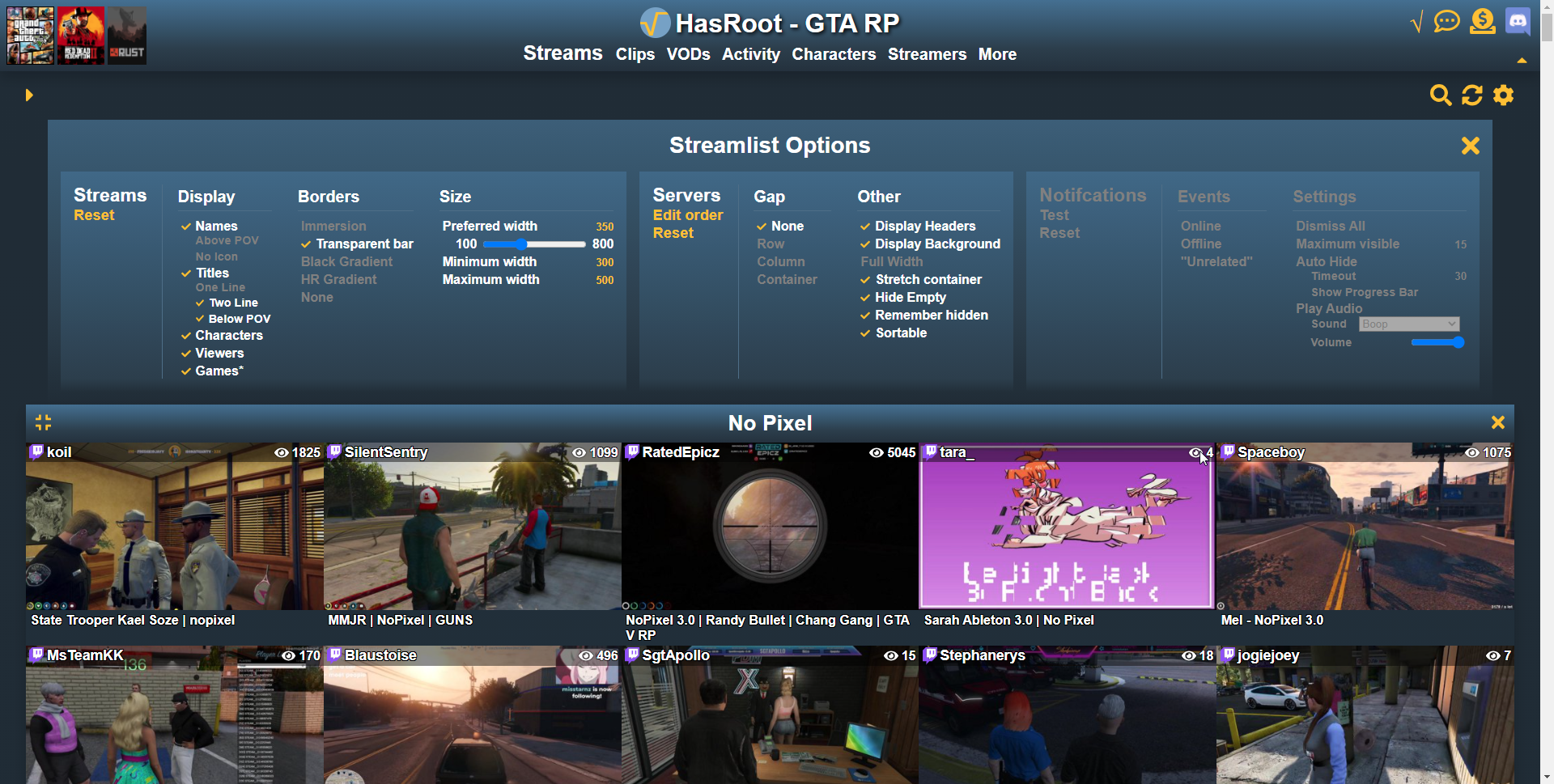
You can now define the size of the streams you want, if you want borders, the names / titles above or below the POVs and a bunch of other things. You can see some examples below, you will mainly want to be changing preferred width to one you like then turn down maximum width so that streams will not scale hugely on single lines. I have left in the settings for reference, the examples were picked to show you different combinations rather than for asthetics.
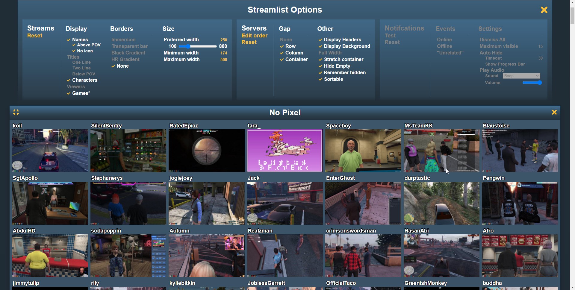
Rather than show characters plastered under every stream with a slide down element that broke the layout of the streams there is now a slide up panel. This is accessible via hover, click or touch on a stream element. I also added two larger buttons to go to the stream channel or streamer profile, but you can still go straight to channels by clicking on the name of the streamer without using these.
There is also a new temporary exclude system, so you can X out a server or container then reshow it with the eye button later. If you go into edit order of the server options you can exclude a server / container entirely and it will not be reshown via the eye button.
Notifications are now disabled by default, but I have added in a dismiss all click mode so you don't have to dismiss every notification individually. I also changed the notification sounds to new ones created by kanalja
MenuBar
A lot of the new functionality relates to picking pages and servers, I also wanted there to be quick access to the type of content people actually navigate more often to, moving streams / clips / vods to the center middle rather than a dropdown. As the new header was notably larger I did add in a hide mode for it.
The issue with the old menu was that some pages we list require a set server to go to, some don't and the question of how to offer that choice of server in that situation. I have brought back the jump functionality and now use slide downs to specify servers when one is required but isn't listed, I made the "- Server filter" in the logo clickable, as a way to quickly change between servers of that game type. The left hand side became the new images as quick navigation to different games. I also moved some of the less utilised pages under more to try and declutter things.
With these updates I decided to also remake the feedback functionality form and build it into the header, as well as the streamer / clip history search.
Settings
I entirely rewrote the settings system in a flexible way to allow future updates, removed the old settings cookies and changed up some of the defaults. This system will be reusable for the site settings which didn't make it into this cut, which will in future allow you to choose a skin and some other functionality.
There's also a new mobile mode for editing server order and favourites/excludes. The favourites system will be tied into notification soons and I want to add a favourites / order system for streamers too in a similar vein.
Misc
There was a lot of functionality / features that were just incredibly mobile unfriendly in the old update, and this update has had a large focus on making things more usable on mobile / touch devices.
I have also updated the clip viewer to be fullscreen and to use more of the space for the clip without going fullscreen. Made it a bit more user friendly.
The gradients (and theme)
It may come as no surprise to all of you that I am not a web designer or artistically inclined, HasRoot always had a focus on functionality as that is something I have experience with. Initially I was more focused on working on spacing and the things that draw your attention when using the site. Also in adding in better functionality and customization to the features we offer. Then when working on the new update Lilly mentioned maybe try gradient on an element, I wasn't sure what one she meant so I started messing around with them and went a little wild.
I ended up making a few variations of them, this one being 'blue3' with the feedback from the HasRoot team, streamers, some of the servers we track and just friends. I have been posting gifs of the update work and even a link to the test site on discord and even in the last blog post. Believe it or not I got a lot of positive feedback :P I knew there was a good chance some people wouldn't like them but I felt it was a huge improvement.
This is why when I made the new update however I made it in a way that is rather easy to skin it. If you hate the gradients and other aspects, this will in future allow you to change them for something else. I have already had someone approach me with some suggested themeing that might be more popular so I will be experimenting with that and see how it works.
Thanks
Thanks for reading this long far and for using HasRoot, it was a site I never intended to make and just want to make it the best it can be. I have a lot of plans for new things to add and this update is just the start of it. There will also be news about that other project coming shortly but this blog has already gotten pretty long.
Also a thanks to everyone who gave feedback during the development process, and there was a bunch of you. And thanks to the entire HasRoot Team who help add data and keep things running around here. And special thanks to Lilly who played a large part in the process. And last but not least kanalja for the new notification sounds.
I really hope you all enjoy the new update, I know not everyone will and if you have suggestions on how I can improve it always feel free to get in touch. Hopefully with some time and feedback I can help address some of the issues people have with it.
If you actually do like the update also get in touch too! I put a lot of work into it and almost every page of the site has been updated in some way.
All the best,
ScottishRambler